Elise Luneau
Visual designer working with data,
sharing stories through insights, systems, and creativity.
Work
Data visualization
The Great Migration
The Great Migration reshaped American geography over seven decades, but most representations are static, text-heavy, and miss the evolution that makes the shift legible.
In 1900, 90% of Black Americans lived in the South. By 1970, that geography had been fundamentally redrawn. This project visualizes the Great Migration through U.S. Census Bureau decennial data, tracking the shift of African American population across states, regions, and cities decade by decade, from the Jim Crow baseline to the demographic transformation of northern industrial centers like Chicago, Detroit, and Philadelphia.
The visualization separates the two distinct waves of migration, the first driven by World War I labor demand and the violence of the Red Summer, the second by World War II industrial mobilization, showing how different economic and political pressures produced different patterns of movement and settlement.
Data source: U.S. Census Bureau decennial records, 1900–1970.
Look at the visualization here.
You can see the data here.
sibling position study
The idea behind this project is to explore how birth order influences the way you behave in relationships. Inspired by Giorgia Lupi’s Data Humanism approach, I wanted to explore the behavioural patterns shaped by our position among siblings (including the experience of being an only child). The research focuses on Gen Z and Millennials: the intention is to observe behaviours that are still in motion, not overly rationalised or shaped by time, but raw, intuitive, and evolving.
This project is ongoing. You can contribute to the research by taking the test here.
pretty in pink
This project traces gender inequality across a lifetime, from the toys marketed to the pension gaps that define old age. Structured as a four-chapter editorial report, the project maps the compounding disadvantages women face at each life stage: childhood and adolescence, young adulthood, midlife and motherhood, and older adulthood.
Rather than drawing from a single dataset, the project synthesizes research across sociology, economics, public health, and labor studies, pulling from sources including UNICEF, UN Women, the OECD, and academic literature, to build a cross-disciplinary picture of systemic inequality. Each chapter pairs key statistics with editorial illustration and a consistent visual language: a monochrome photographic centerpiece, pink-accented data callouts, and section-based breakdowns across categories like health, finances, work, and safety.
fashion trends
Fashion trends leave data trails. This project tracks how styles emerge, peak, and fade, combining Google Trends search data, runway reporting, retail statistics, and social media signals to map the lifecycle of 2024's defining aesthetic movements.
Each trend spread pairs quantified search interest with editorial imagery and sourced retail figures, showing, for instance, how "Mob Wife" spiked in early 2024 before collapsing by year's end, or how Cowboy Core translated into a surge in cowboy hat sales. A parallel color analysis tracks the dominant hues across fashion shows month by month, extracting palette data from runway looks to reveal seasonal color patterns across the industry.
Sources include Vogue, Pantone, Who What Wear, Marie Claire, GQ, Google Trends, and The Trend Spotter.
olive oil in europe
The EU accounts for roughly 53% of global olive oil consumption, both the largest producer and largest consumer on the global market. This project maps the full economic picture behind that dominance, tracking who produces it, who consumes it, how it moves across borders, and what it costs.
Drawing on data from the International Olive Council, Eurostat, and Statista, the project visualizes four dimensions of the European olive oil market: per-capita consumption by country, total production volumes, export flows between producing and importing nations, and price trends across Southern European countries. A Sankey diagram traces the trade routes connecting Mediterranean producers to markets as far as the United States and Brazil.
Sources: International Olive Council, Statista, agridata.ec.europa.eu, oec.world.
women in afghanistan
Women's rights in Afghanistan are mentioned in the news, but rarely the subject of dedicated visual investigation. Since the Taliban's return to power in August 2021, Afghan women have faced a systematic dismantling of their rights, in education, employment, mobility, and public life. This project documents that regression through a chronological timeline of key decrees and restrictions, paired with current statistics on access, representation, and freedom.
The background text lists every single day that has passed since August 2021, a quiet counter of elapsed time.
Sources: HRW, UN Women, Amnesty International, Le Monde, The Times.
pasta consumption
Pasta is one of the world's most traded and consumed foods; but how, what shape, and with what sauce varies considerably by country. This visualization maps global pasta consumption and trade in 2022, covering four dimensions for each nation: per-capita consumption, favorite sauce, preferred pasta shape, and import/export relationships (connecting lines weighted by trade value in USD).
Sources: Statista, TradeMap, OEC, and a range of country-specific culinary sources.
food poster
A series of illustrated reference posters mapping food as cultural geography. Each subject, pasta shapes across Italy's regions, cheeses across France, and classic cocktails, is presented in two formats: a geographic map locating each variety by origin, and a taxonomy grid organizing each variety side by side.
The project sits at the intersection of information design and editorial illustration, using hand-drawn visuals to make regional culinary data both precise and approachable.
danish territories
Denmark's colonial history spans four centuries and four continents, from Greenland and the Faroe Islands to the Danish Gold Coast, the West Indies, and trading posts in India. This map charts the full geographic extent of Danish territories, covering each location's duration of control, colonial importance, traded goods, and date of independence.
Sources: Danmarkshistorien, National Museum of Denmark, colonialvoyage.com, postkolonial.dk.
total population
Population growth is uneven, across decades, continents, and economies. This visualization tracks the 18 most populated countries in 2020 after China and India, mapping six decades of demographic change from 1960 to 2020, cross-referenced with GDP and gender breakdown for each country.
Sources: data.worldbank.org
Other projects
Type tool
Interactive animation tool created with Codex. Draw a path, write your text, and edit it.
Open in a new tab.nãra
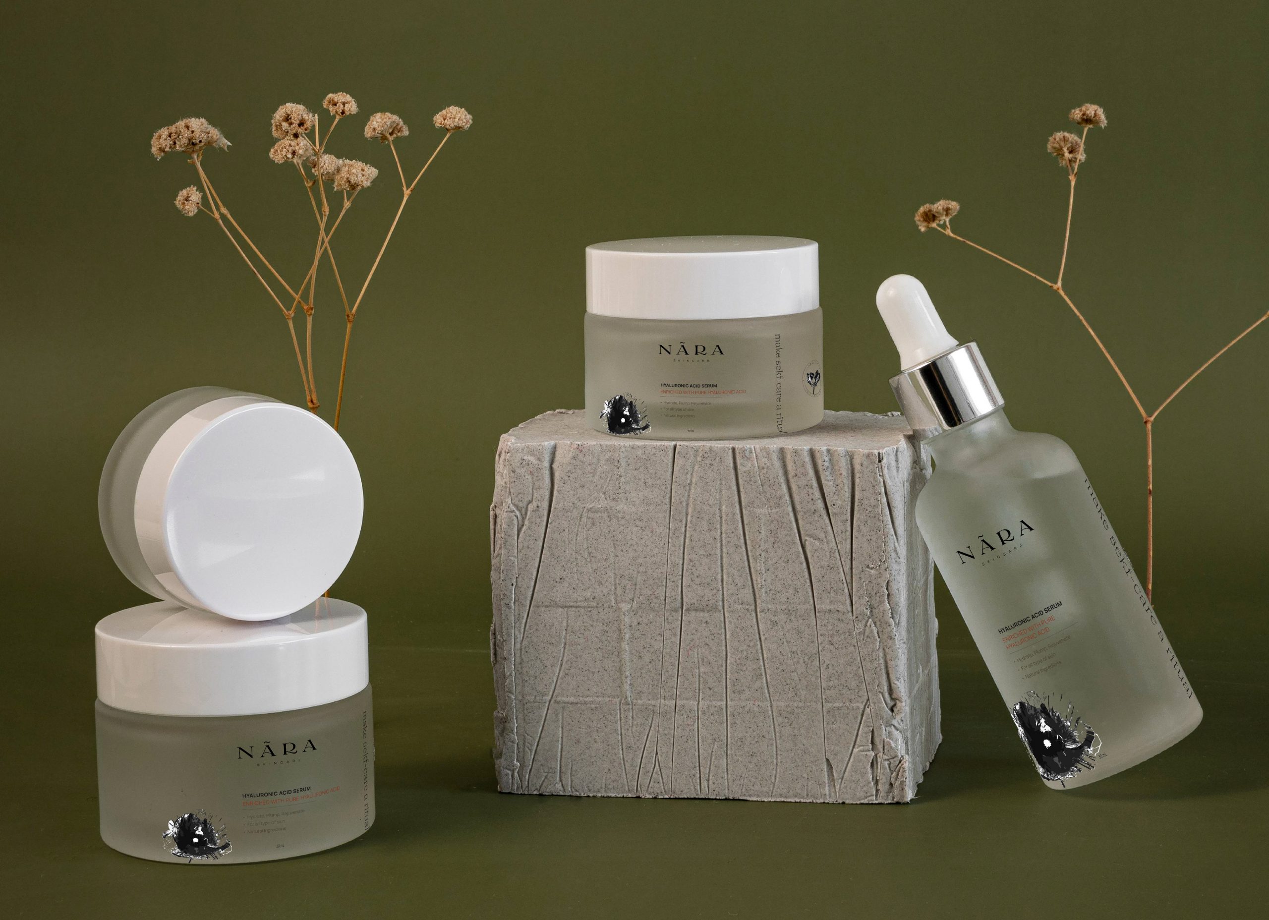
Brand identity and packaging for the skincare brand Nãra. The goal: build a brand that feels organic and handcrafted without losing elegance, rooted in botanical apothecary aesthetics.
For this project, I developed the full identity from logo to packaging, pairing a high-contrast serif wordmark with botanical illustrations, anchored by a restrained earth palette of off-white, olive, and terracotta. The hand-drawn elements stay intentional rather than rustic; the typographic hierarchy does the heavy lifting on refinement, while the botanicals bring warmth. The system covers logo variants, product labels, packaging, and social formats, cohesive across every format.
romane
Romane is a display serif created through a mix of AI and hands-on work. I began by generating Midjourney images inspired by the ancient Greco-Roman alphabet. From one of those images, I sketched a more modern alphabet by hand before refining it digitally, translating the letterforms into a contemporary display typeface. {in progress}
lookbook
Editorial lookbook for a Danish fashion brand's Fall 2024 collection. Working within a minimalist-boho visual language, I designed the editorial layout, image editing, and lettering for the logo. The grid alternates between full-bleed spreads and multi-image compositions; giving the clothes room to breathe while maintaining rhythm across the publication. The white space and restrained typography keep the focus on the garments, letting the photography carry the editorial weight.
antoni
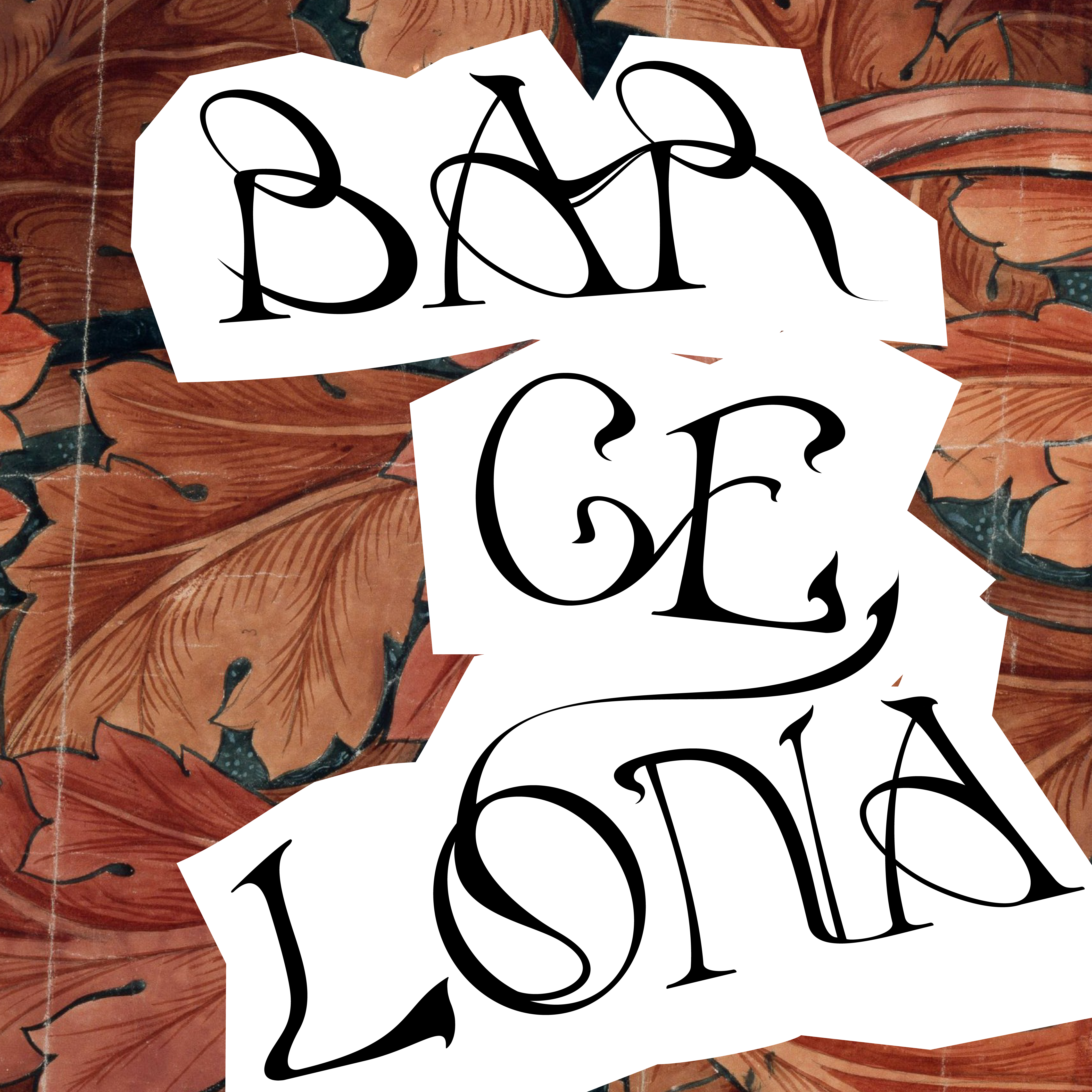
During a trip to Barcelona, I started sketching a typeface inspired by Catalan Modernism architecture and the ornamental language of Gaudí, exploring expressive curves, high stroke contrast, and complex ligatures. {in progress}
mangia
Editorial piece exploring the connection between Italian food and cinema. For this project, I designed the full layout and lettering for the masthead, building the grid around a three-column structure referencing the Italian flag. The typography and photography alternate between full-bleed and text-heavy spreads, following the rhythm of the subject matter.
Les Nocturnes de l’histoire
Poster design for Les Nocturnes de l'Histoire, a series of events by the Sorbonne University Library exploring a different theme each edition. The goal was to build a visual concept flexible enough to carry across future editions, a consistent structure where the photograph is the main element. For this first theme around confinement, blur and motion run through both image and type to convey the feeling of an enclosed space. The typography, Chakra Petch by Cadson Demak, balances the institutional context of the university with a more distinctive, contemporary edge.
skipit
In 2020, I joined Skipit, a platform encouraging travelers to explore cities through eco-friendly, local transportation, as a UX/UI designer. For the app, the visual direction leaned toward minimalism and accessibility: a blue palette and playful typography designed to make the experience feel open and approachable. The interface centered on two core interactions: a map prioritizing green transit routes, and a social feed where users share places through photography.
For the website redesign, we shifted away from the eco angle and pushed a more social, inviting tone, warmer and more dynamic than the app, with a clear focus on driving downloads.
About
Services
Bio
I'm Elise, a visual designer based in Copenhagen, working at the intersection of UX/UI and graphic design. My practice is built on visual storytelling and interaction design, transforming data and narratives into experiences based on research, visual encoding, and user-centered design. Curious by nature and eager to learn, I approach each project as an opportunity to find the angle that makes complex information stick.
Romie, Claude Type , designed by Margôt Lévêque.